Case Study: Isle of Barra
A New Vessel for Isle of Barra
Client Name: Isle of Barra Distillers
Brand: Isle of Barra
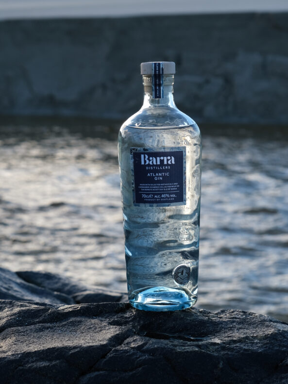
Bottle: Isle of Barra Atlantic Gin
The Company
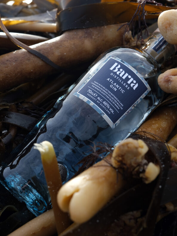
Standing out in the Atlantic on the far western edge of Scotland, you’ll find the Isle of Barra Distillery. The family-owned distillery was born from a desire to return to the family’s roots and create Scotland’s most westerly distillery. The team’s love for their home on the Island of Barra can be seen clearly in their support of protecting local species such as the endangered Corncrake bird. So, it was important that their love for both their home island and the sea are represented in their glass packaging.
The Aim
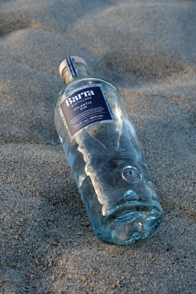
It was important to Isle of Barra that a design was created that not only reflected the premium quality of their Island Spirit but also did justice to the brand, their Island home, and their company.
They wanted their packaging to have a premium look and feel that would stand out on the shelf, whilst also paying close attention to sustainability by introducing recycled glass content into their bottle. With their want for a mix of premiumisation and sustainability, Verallia was the ideal partner.
Collaborative Design
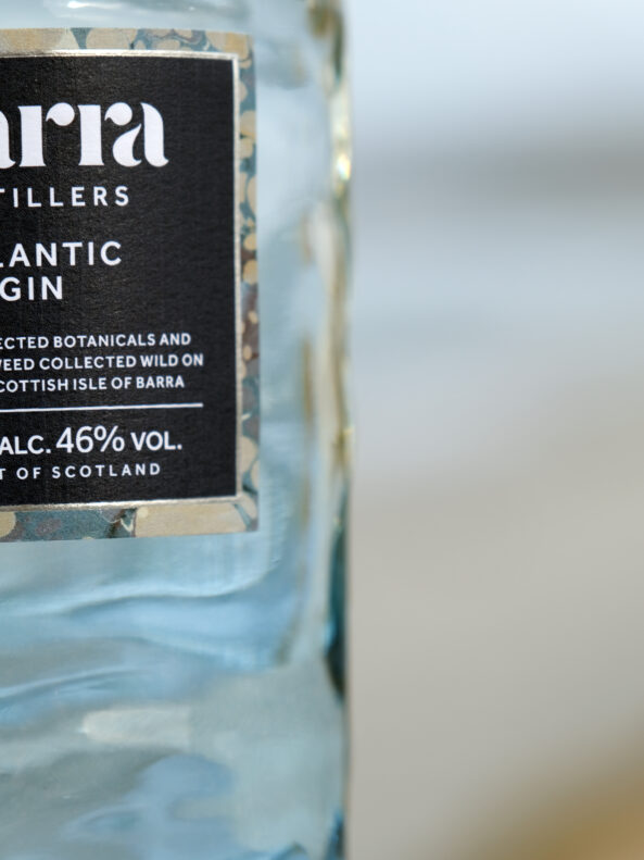
The Isle of Barra creative team commissioned Jemma Lewis, a hand-marbling artist based in Wiltshire, England to create a bespoke, hand-marbled pattern to be used within the packaging design. Taking a colour palette inspired by Barra’s landscape and shores, Jemma used the distilleries signature botanical, carrageen seaweed, which the distillery collects wild on the island’s shores, to create the unique marbling patterns forming a physical link between the gin and glass packaging.
Decedent Glass Details
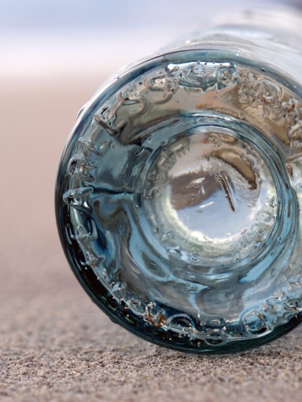
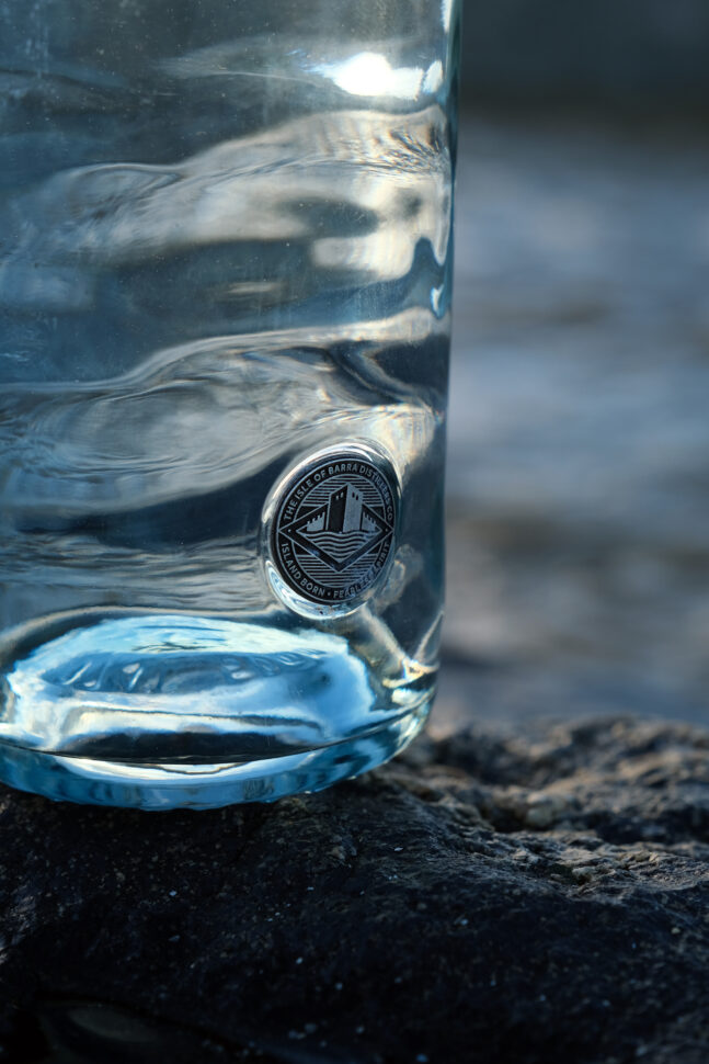
It was imperative to Isle of Barra that their glass packaging emphasised the tranquil blue and turquoise waters which surround their home. So, our technical experts explored how they could adapt the texture of the glass to show uneven ripples throughout the bottle. This was in a bid to develop a glass bottle that not only looked like the waves of the sea but also represented a bottle that had been rolling around in the sea before washing up on the shore.
The delicate blue tint was added to the bottom half of the bottle, again to be in keeping with our signature blue branding and also to evoke the blue from the Atlantic Ocean.
A Sustainable Ethos
Showcasing a love for their home island also meant presenting a love for the environment through their glass packaging. To do this, the distillery wanted to move away from using a stock bottle made from 100% extra white flint glass and with our support now have a bespoke designed glass bottle that instead contains 52% recycled glass content. The bottle weight has also been reduced by 17% and choosing to work with Verallia UK, situated in Leeds, has meant that their glass bottles are being produced 383 miles closer to the distillery than their previous supplier.
Moving to a higher level of recycled content within their glass bottles creates less consistency in the glass, meaning each bottle is unique, further adding to the character of the brand.
“This isn’t just a new bottle or a new marketing strategy. This is the positive change that we have wanted to do for some time.” – Michael Morrison, Managing Director/Head Distiller
A Dream Vessel
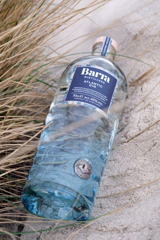
Isle of Barra refers to their new glass packaging as being a vessel, to depict that the connection from the Isle of Barra to the sea is endless, as is their relationship between the sea and their award-winning Gin.
We are thrilled to see how much the team loves the new vessel for their Gin, and it’s not just the team that loved it, it has been recognised by numerous industry-leading awards, including the Glass Focus Awards by British Glass, taking home the prize for Design of the Year.
Since then Verallia has been commissioned to support Isle of Barra with their dark rum creation, even spray painting the bottle black to give it a distinctive flair.
