Case Study: Sipello
Sipello’s Story: Eccentric & Exquisite Glass
Client: Sipello
Brand: Sipello
Bottle: British Aperitif
The Company
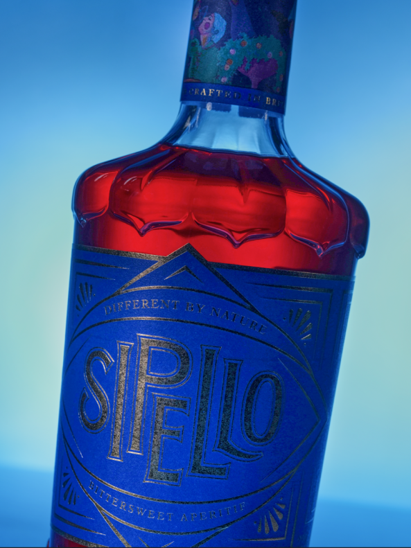
Handcrafted in the Surrey Hills, Sipello is a British Aperitif that marries a gooseberry-led blend of British ingredients such as rhubarb and chuckleberry with sustainably sourced botanicals from around the world.
Sipello, the brainchild of Tim Simmons is a unique aperitif and the ambition was to create a truly British brand that wasn’t artificial but infused with mainly locally sourced ingredients. He wanted a drink that was simultaneously versatile and complex so that it could transcend occasion to be equally as comfortable in top end bars as it would be in a home bar for entertaining guests. The versatility of the liquid was designed to appeal to world class mixologists and to a Sipello and tonic drinker at home.
With such an exquisite drink, he required the packaging to match. That’s where we stepped in.
A Truly Unique Creation
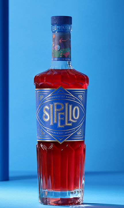
The goal was to create a superb bottle, that stood out on any shelf. It had to be decorative to instantly attract attention.
Tim’s mantra for its back bar presence throughout the process was “stand out, blend in, repeat”. The design was always to make it look like an established international craft brand, so it could stand its ground against major competitors.
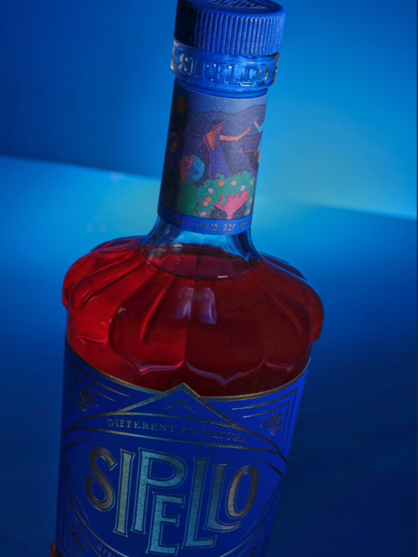
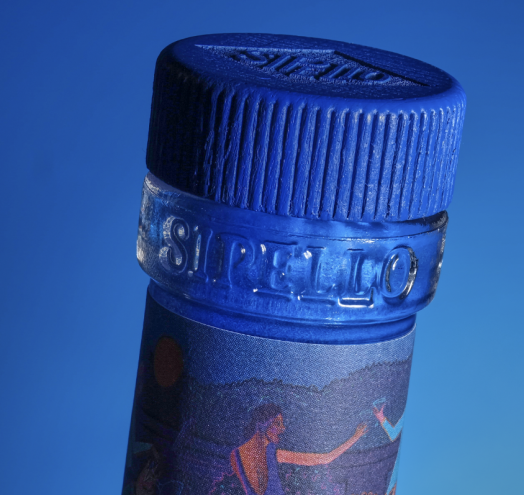
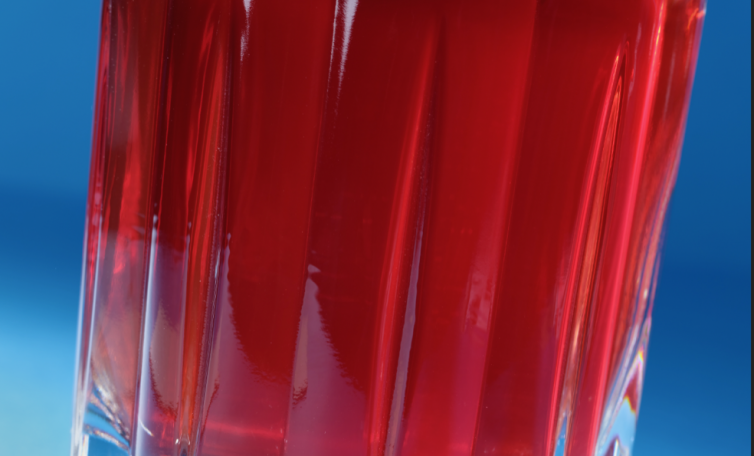
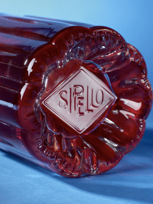
The bottle design infuses both a floral and an art deco vibe. The striking bottle has a distinctive shape that curves and flows with a floral design reflecting the liquid within. It incorporates embossing detailing adorning the neck and, on the bottom which imitates petals, in particular Iris and Lily, in honour of his daughters. The underneath of the bottle is also embossed with the word Sipello as a final statement. All in all, achieving a dignified and noticeable presence.
“I think we really achieved what we set out to do, I think the bottle is stunning. The glass is flawless and the details are fantastic.”
Tim Simmons, Founder of Sipello
Overcoming Challenges
When Tim approached us, it was a difficult time, in the midst of a global pandemic to be exact and sourcing glass was no easy task. In a lockdown, most manufacturing facilities were not operating to full capacity, so sourcing a new order of glass became very difficult. His design agency, Kingdom & Sparrow recommended us as the place to go.
“I was put in touch with Nolan, and we hit it off straightaway. He is steeped in industry background and understood what I was trying to achieve. He was also a sounding board for various ideas, and how quirky we could make the bottle.”
The brand sure made a statement when it hit the market. The final glass was developed in extra white flint glass, Tim’s ambition is to promote customers to re-use the bottle, whether that be converting it into a candle or filling it with lights.
After all a bottle this beautiful should be treasured.
A Collaborative Approach
For us at Verallia, it’s not just about the end result, it’s the journey along the way and with every client we promote knowledge sharing and have an inclusive process where we involve clients at every stage.
“The team is great, they are insightful, helpful and very communicative. They have been patient and adaptable. They have so much knowledge of their craft but also understand mine and have a holistic view of the overall market.”
Sipello’s brand is truly one of a kind, and the aim of developing glass packaging that differentiated the British Aperitif from the rest was truly captured in this eccentric bottle design.
